Version 3, End of an Era
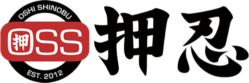
For the past 5 years the Kanji, Oshi Shinobu, which means to persevere under pressure, has been the one consistent design element of all our kimonos. The Kanji and it's meaning defined our company, our core values and our beliefs. We could think of no better design element to feature.
We weren't the first company to use Kanji and we wont be the last. Over the years though more and more companies have started using Kanji and it's to the point that our gi and our company are no longer distinguishable from the plethora of other companies that use similar design elements. The only way to know what's ours and what isn't would be to put it on, the fit, quality and comfort easily distinguish us from the rest.
In May when we made the commitment to do this full time we started looking for a new logo or symbol that would help us stand out yet still represent what we are about. After a month of revision and searching we settled on an OSS mon, a unique flower and logo that carries with it our hope for the future while honoring our roots.
No one knows what the future holds but we do know that these last batch of Version 3 will be the last for awhile with the OSS Kanji on the sleeves. Look for our newest designs featuring our Mon logo coming soon and thank you for all the support!


